Wednesday, 19 December 2012
Karen Le Roy Harris
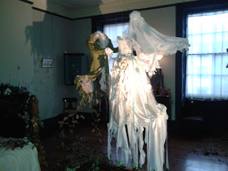
Went to an exhibition at the Jersey Museum. The museum contains a victorian house and in recent months it has hosted the works of artist Karen Le Roy Harris. Countless hours of making has gone into the fabric and paper decorating to transform the victorian house into an other worldly experience. Each room is decorated according to its usage and reflects the character of the victorian tennant. Check out her website at http://www.karenleroyharris.com/
Friday, 7 December 2012
Upcycling an old sleeveless jumper/woolen vest
Choosing a chunky button to match of course!
First turn your jumper inside out, then pin and stitch the bottom seam.
I was a bit aprehensive about putting my jumper through the sewing machine as the fabric was quite thick... but it went just fine, just make sure you take it slowly and don't push your machine too hard!
As its a jumper already theres no need to stitch up the sides... make sure you cut off the extra fabric beyond the stitch line as you dont want any awful strange bulging.
I also stitched up the arm holes whilst the vest was inside out, (pin it then stitch it) this top part of the jumper formed the flap for the top of the cushion.
 Le Voila!
I left the neck hole openas this is where the cushion stuffing went in and then added a button to finish it off. Don't forget to cut off stray threads!
For a first attempt I'm fairly pleased with myself. It's a little lumpy... but it's better than being something that just sits in the cupboard.
Monday, 3 December 2012
Redo - Flowers
Flower searching re-do. Quirkier shapes, more colours, more cramped feel to the image and a more anxious look on the characters face. The image below was created with only pencil colour, the one above also includes ink.
Compared to previous :
Finalised imagery from storyboard ...
From this:
To this:
Ride that bird!!
Thought that looking down on the Quetzal (though it's a lot of green) would be a more appropriate angle as you can see the wings more clearly and feature the tail. the defining feature of a Quetzal is, after all, its crazily long tail.
Collecting Feathers
Thats right.... it's a little puffin! My scanner at home really saturates the colours of the original image :(
After being scanned in at uni, you can see the difference...
Sunday, 2 December 2012
Single page narrative illustrations
So here are a few images of drawings I've done recently for single page spreads, I have most o' the double page spreads sorted now, so it's time to focus on the smaller details. My scanner at home really saturates the colours on the images, so I think I'll have to re scan these images at Uni.
Saying farewell
And example of a page featuring multiple small illustrations, though I feel the text placement needs work...
Creating a defined shape for a few illustrations which feature scenery, adds variation to the imagery and interest. Though I also intend to create some illustrations that will fill the single page spread I do like this oval approach. Plus the white space leaves room for text.
Had to slip in a cliche owl. Here the perspective is er.. interesting, though it's meant to seem a bit ominous at this point in the text.. before the drama happens! The darkness below in the image alludes to this.
Subscribe to:
Comments (Atom)


