Wednesday, 19 December 2012
Karen Le Roy Harris
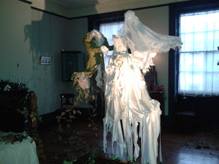
Went to an exhibition at the Jersey Museum. The museum contains a victorian house and in recent months it has hosted the works of artist Karen Le Roy Harris. Countless hours of making has gone into the fabric and paper decorating to transform the victorian house into an other worldly experience. Each room is decorated according to its usage and reflects the character of the victorian tennant. Check out her website at http://www.karenleroyharris.com/
Friday, 7 December 2012
Upcycling an old sleeveless jumper/woolen vest
Choosing a chunky button to match of course!
First turn your jumper inside out, then pin and stitch the bottom seam.
I was a bit aprehensive about putting my jumper through the sewing machine as the fabric was quite thick... but it went just fine, just make sure you take it slowly and don't push your machine too hard!
As its a jumper already theres no need to stitch up the sides... make sure you cut off the extra fabric beyond the stitch line as you dont want any awful strange bulging.
I also stitched up the arm holes whilst the vest was inside out, (pin it then stitch it) this top part of the jumper formed the flap for the top of the cushion.
 Le Voila!
I left the neck hole openas this is where the cushion stuffing went in and then added a button to finish it off. Don't forget to cut off stray threads!
For a first attempt I'm fairly pleased with myself. It's a little lumpy... but it's better than being something that just sits in the cupboard.
Monday, 3 December 2012
Redo - Flowers
Flower searching re-do. Quirkier shapes, more colours, more cramped feel to the image and a more anxious look on the characters face. The image below was created with only pencil colour, the one above also includes ink.
Compared to previous :
Finalised imagery from storyboard ...
From this:
To this:
Ride that bird!!
Thought that looking down on the Quetzal (though it's a lot of green) would be a more appropriate angle as you can see the wings more clearly and feature the tail. the defining feature of a Quetzal is, after all, its crazily long tail.
Collecting Feathers
Thats right.... it's a little puffin! My scanner at home really saturates the colours of the original image :(
After being scanned in at uni, you can see the difference...
Sunday, 2 December 2012
Single page narrative illustrations
So here are a few images of drawings I've done recently for single page spreads, I have most o' the double page spreads sorted now, so it's time to focus on the smaller details. My scanner at home really saturates the colours on the images, so I think I'll have to re scan these images at Uni.
Saying farewell
And example of a page featuring multiple small illustrations, though I feel the text placement needs work...
Creating a defined shape for a few illustrations which feature scenery, adds variation to the imagery and interest. Though I also intend to create some illustrations that will fill the single page spread I do like this oval approach. Plus the white space leaves room for text.
Had to slip in a cliche owl. Here the perspective is er.. interesting, though it's meant to seem a bit ominous at this point in the text.. before the drama happens! The darkness below in the image alludes to this.
Friday, 30 November 2012
WEBSITE LAUNCHED
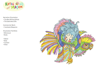
Hello there chaps! So my official portfolio website is now up! Please do have a good nose.built using view book, a really easy to use portfolio template website. Only problem being that the link to my Etsy shop only seems to work if you right click it and open in a new tab... SABOTAGE.
A cheeky screen shot!
Any queries please email : hello@katiemacon.com
Adding text
I was a bit concerned about the composition of this page... however with the text added it's not so bad.. please imagine all these pages as double page spreads
The text fits quite nicely on this page.. but I think this spread is my favourite so far...
I did need a fair bit of space here to fit in the concluding text... but it does seem a bit crammed compared to the rest of the book... as if the ending has just been shoved in, where as the previous pages have minimal text... though in terms of looks, I much prefer this page with added text than simply a sole image.
Intro page
So the opening page, sets the mood of the book I think... that poor unsuspecting bird. Its a yellow legged button quail incase you were wondering. (Haha, except now I've updated it, illustrated is spelt correctly!! Unlike the image above! I wonder if you had noticed!)
Typography
Well now comes the brutal task of dealing with font, something which is not my forte. Though I decided as my book is bird themed it seemed to make sense to create a title which was created using feathers, so heres the progress work for the cover of the book.
Thinking of fitting the text into some form of wing shape
Or just having a few feathered words...
But instead I chose this approach, black was too harsh against the front image so to fit with the rainforest it became green.
Voila!
Now to play about, here are a few progress screen shots.
Doesn't stand out as much as I would like..
Added 'illustrated by' hand written.. my handwriting eugh...
Drop shadows to make it more bold
Then the background blurb... papyrus is not the font for this project me thinks..
and a simple sans serif didn't seem to have enough character
Far too elegant!
Hang on... i think we're onto something here... chalkduster, what a brilliant font. Rough yet nice and rounded at the same time..
Looks grand to me, with a white stroke around the green font and a bit of a drop shadow.. I think I'll scratch the hand written 'illustrated by' and replace it with this, it looks much better...
Old author tag line
New one, ok you can't really see the difference here... but hey!
Playing with the title text
Hmm I think the original was the best option actually... ahh well you don't know until you try it out!
Ok so final outcome here:
Unused imagery
Though I do like this image I don't think it will be used within my final book. Thought I would share it all the same though!
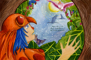
Making promises with the Quetzal.
Thursday, 29 November 2012
Logos
I've been building a portfolio website.. I know shocking! As much as I love my blog, to be a true pro I'm going to need to showcase my work... and in order to do that I want to revamp my logo... the one above though I love... it was drawn 3 years ago when i was sat next to a scanner thinking 'oh flip I need a header for my blog'. Not bad for a spur of the moment job... but here are a few outcomes.. and also I'm thinking of doing an 'about' page with a tad of info about me... and I thought the final image really summed me up quite nicely.
I think this one might be the keeper... simple but very sweet
Me...in a nutshell...
And for good measure...
Subscribe to:
Comments (Atom)


