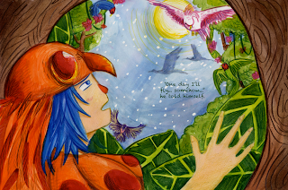
I was a bit concerned about the composition of this page... however with the text added it's not so bad.. please imagine all these pages as double page spreads
The text fits quite nicely on this page.. but I think this spread is my favourite so far...
I did need a fair bit of space here to fit in the concluding text... but it does seem a bit crammed compared to the rest of the book... as if the ending has just been shoved in, where as the previous pages have minimal text... though in terms of looks, I much prefer this page with added text than simply a sole image.


No comments:
Post a Comment